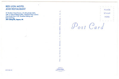


And here's how I described them in my submission to The Postcard Collective.
I have produced a series of postcards documenting landmarks of my hometown of Eugene, Oregon. Eugene is blessed with a wide variety of architecture, some beautiful and some horrible. My cards make no distinction. They document the city democratically, selecting viewpoints that I feel best represent what it feels like to live here. The photos are all recent but I've given the cards a historic look through careful selection of typeface and color balance. They have the look of a card you might find in a highway service station in 1975, and indeed part of my project is to conduct clandestine distribution of the cards in local postcard racks in gas stations and tourist centers. The project pays homage to Shore's Amarillo series and also to the great American postcards of the 60s and 70s.
Each card is 4 x 6, produced by combining a drugstore C-print with individually captioned adhesive postcard template.
8 comments:
When I worked in for the paper in Lake Oswego a long time ago, a vacationing colleague sent a postcard to the newsroom. Mostly, it showed the parking lot of the motel where he was staying (in Wilsonville, if I remember correctly). My boss wrote in a column that it was the only postcard he'd ever seen that made him feel sorry for someone on vacation.
I can see your postcards having the same effect. So well done! And good luck with your project. Sounds like fun.
Also, I like the shot of the Greyhound terminal.
Sounds like your boss needs to get out into the world more.
Stephen Shore related that back in the early '70s when he had several thousand postcards made of photos from American Surfaces to sell at a NY bookstore, even the ones taken on cloudy days were printed with blue skies- because, he was told... post cards have blue skies.
PS- Not one sold.
B, they say:
To be considered for membership status, one must demonstrate a serious commitment to the project
And they sound very serious indeed.
Excellent artwork, but it's the mission statement that will matter. Can't you revise your proposal, calling it a postmodern intervention that will interrogate something or other? Needs moar bullshit!
(And deckle edges, please.)
Stan, nice of you to notice the blue skies which I added in Photoshop. I think they're especially suited to a Eugene series because blue skies here are rare.
Microcord, I'm not seeking to join the collective, just entering my cards for this round. My track record indicates I'm likely to be rejected anyway, so mostly this project is for me.
Those are great, B. Any leftover stock and I'll put 'em out as bookmarks at the library...
"Boring"
boring ⇒ Parr-collectible
Now you're in with the in crowd. Congratulations!
(Yes, it's partly those blue skies. They're so . . . transgressive.)
Post a Comment