I've had a few days now to digest the inaugural issue of
Lay Flat 01: Remain in Light. Here are some first impressions:
 General Design
- Physically separating the text and images bothered me at first but I've grown to like it. The layout, typography, & general design of both sections by Katherine Hughes is very good.
 Sample pages from Lay Flat 01: Remain in Light
 Looseleaf Photos
- The choice to include photographs as looseleaf cards is interesting and original. It took me some time to see the full potential. The photos can be read in order just as with a conventional publication. But unlike a regular book the photos can be further transformed. They can be stuck on a wall, shuffled at random, traded like baseball cards, whatever. The really interesting application is the ability to re-sequence and re-edit the photos and by so doing derive new meaning from them. Take some out, add some of your own. The power is in the hands of the reader and I like that. One sequence I found interesting was to put the artists in birth order. The original order --alphabetical by first name-- is also intriguing. I'm sure everyone will come up with their own favorite. The good news is they'll all lay flat.
 Photographs shown in reverse order of area code
 Capturing This Moment
- I realize that there is no way to sum up the photographic zeitgeist in one project. Still, Lay Flat is as good an effort as any. In the past few months I've heard about this journal from many different quarters. I suspect most photographers of a certain ilk (ambition?) have been perusing Lay Flat this week, and so on some level it has been thrust into the role of community organizer and taste arbiter. Family of Man this ain't, but it comes close to being a version for the Twitter generation.
 The Photographs
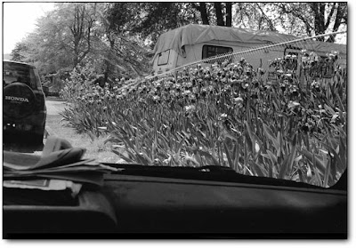
 I suppose any selection of images would be open to second guessing. Kudos to Lavalette (pronunciation? \Lā · flat\) and Wildenhaus for making a coherent effort. The general emphasis here is on color documentary work, and that's fine. Many of the usual emerging suspects are included, along with some not so familiar. My favorites were images by Hiroyo Kaneko, Michael Campeau, and Nicolai Howalt & Trine Søndergaard. Ask someone else and they'll choose others.
 Kromanns Remise II, 2005, by Nicolai Hawalt and Trine Søndergaard
 Great Interview
- Shane Lavalette's interview with Mike Mandel is wonderful reading. Great questions, great subject matter. Mandel is a photographer's photographer whose legacy could use a burnishing. So thanks for that.
 Academic Writing
- For me, the other written pieces (with the exception of clear, concise Tim Davis) were not very compelling. Darius Himes spent a page defining docility. Cara Phillips' attempt to take the pulse of the moment was a meandering stream of generalizations (
"We now exist in a world where new is virtually impossible" ???). Eric William Carrol's essay might appeal to those few who enjoy Barthes but for the rest of us it felt needlessly academic. Attention all writers, if you feel a strong need to use footnotes and declare that you went to art school, why not kill two birds with one stone and include the MFA reference in a footnote? * Save us a little time. And the poem at the end? I've read it five times and I'm still lost. I think it might be better to leave poetry to the beret and turtleneck crowd while photographers concentrate on making images, at which Fulford and Philllips for example are both quite talented.
 Tone
Tone- I've hinted above at my main problem with Lay Flat. It's downright stuffy. If you were a layperson on the street and your only exposure to photography was through Lay Flat, photography would probably seem hopelessly dry, boring, and clinical. Where is the fun? Where is the absurdity? The humor? The games? Making photographs can be a beautiful, spontaneous, creative act. But the articles here (and to some extent the photos) treat it like a butterfly pinned to an examination board. Loosen up, have some fun, explore. Untuck your shirt, give your essays grassstains, pretend it's the seventies again, I don't know. I'd like to think that life is beautiful and I don't get that feeling from any photo journal. Not Aperture, Blindspot, Contact Sheet, Lenswork, nor Lay Flat. Where oh where in Neptune might that beautiful journal be?...
*
Made you look! That's what I think of footnotes


