The recent
Aperture (205) contains an interesting article by Stephen Shore discussing this solstice photo:
 Beverly Blvd and La Brea Ave., June 21, 1975, Stephen Shore
Not only is this one of Shore's more famous images, it's probably one of the better known photos of the last half century made by anyone. But at the time Shore made it he wasn't quite satisfied. As related in the article, he felt it might be "imposing a classical pictorial organization" on the scene. Here's how he described his thought process in a
2008 interview with Darius Himes:
So I took this picture, and after I took it … I guess this goes to interpretation and structure and the form of our time. I realized that I was structuring this in a very classical way, with one-point perspective, with things that are setting up the frame and setting up the foreground and I had fun doing it. I was going through a period of seeing how densely I could structure a picture and how far back into the picture I could look and how much I could set up all of this complex picture structure. At the same time I'm thinking, show the very age and body of the time, this form and pressure. Is this it? Or is this a structural understanding that I'm bringing to it that isn't inherent in the scene? I went back to the same intersection the next day and took this picture, which is looking this way towards the other part of this intersection.
 Beverly Blvd and La Brea Ave., June 22, 1975, Stephen Shore
DH: It's a completely different picture; hardly even recognizable as the same intersection.
SS: And it feels more like the photographer is hardly doing anything.
DH: The one feels like a very complex structure and this other feels less so. More like a casual snapshot. Do you feel like this shows the form and pressure of the time?
SS: I do. At least that was the direction my thinking went for the next year or so.
The two photos are indeed very different but a little sleuthing relates them spatially:

A few comments. The first photo was shot late afternoon 6/21. The second roughly 21 hours later. This means that either Shore is the fastest color sheet-film developer ever or he went out blind the second day with an inexact idea what he'd shot already. In either case, impressive. Secondly, I can't help wondering how much the first photo is a reaction to this image:
 Standard Station, Amarillo, Texas (1963), Ed Ruscha
Shore had to have known Ruscha's painting, in which case it seems too much of a coincidence that he'd include a Standard sign. When he critiques his own photo as being shot in "a very classical way, with one-point perspective," I can't help thinking he's also talking about Ruscha. Just speculation. Of course
gas station images have a long tradition in photography, so he may have been commenting on the whole genre.
In any case, great intersection. Landmark photos. And how many locations can claim to have inspired their own
photographic project?


That's right. La Brea Matrix has spawned a cottage photo-making industry around Shore's shot. Six German photographers have been commissioned to shoot LA in the spirit of the Chevron sign. It's been going now for a while but I only recently tuned in. One might expect some cross-pollination with
this project but as far as I can tell they're two separate endeavors. I guess Germans just dig Shore.
 Photos of the La Brea Project by Janko Woltersmann
Meanwhile, the original photo quietly reverberates. As far as I know
Dalton Rooney was the first to examine it through Google Streetview.
 184 N La Brea Ave, 2009, Streetview image by Dalton Rooney
Today the same Streetview can only be seen from across the divider:
 186 N La Brea Ave, 12/1/11, Streetview
Whew. Talk about one-point perspective. Too classical. Maybe I should go back tomorrow and rephotograph.
Here's a cleaner view, a recent boots-on-the-ground reshoot courtesy of
Ted Soqui for LA Weekly.

And a night view:
 Chevron (La Brea & Beverly), May 5, 2011, Lawrence Solum
That's all fine and dandy but the real action is happening at the Valero Station across Beverly Boulevard from the famous Chevron (straight ahead past the sign in the original photo).
 Ikurnasky
It's not so much the station itself which is interesting but the surroundings. They're dense with urban detritus.
 Grand Opening (La Brea & Beverly), August 1, 2011
Danny RodriguezHere's a more direct shot of the pink wall:
 Northwest corner of La Brea and Beverly, 2011
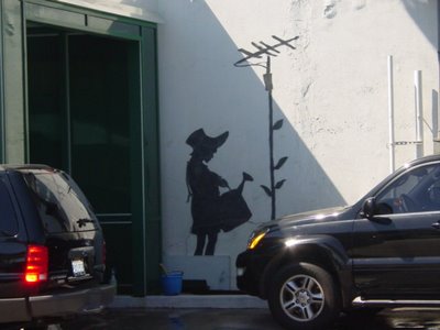
by Catherine Schofield SezginAround the corner the station wall has been tagged by none other than the notorious Banksy:
 Banksy Mural, La Brea and Beverly, Scott M. Haskins
Apparently Banksy made the mural while in LA for a wedding and got permission beforehand from the owners. Now it is slated for removal and/or possible relocation. Don't ask me how one removes a spray painted image while keeping it intact. This Streetview image from yesterday shows it covered up while powers-that-be try to decide its fate.

Actually that's only one of two Banksy murals on location. This one is around the corner:
 Banksy mural, photo by JMB
Here's a Streetview photo to locate it mentally.

The green wall in back is the one near the Banksy mural. For folks that actually live in LA I think these murals must be fairly well known since there are many photos of them online.
What I'm curious about is did Banksy target that location specifically because of the Shore photo? It seems likely that he would have at least a passing familiarity with Shore's photo. And if so, maybe the paintings are some sort of reaction? Who knows. Only Banksy and he's not telling.
The alternative explanation appeals more. I like to think that Shore and Banksy found this intersection completely independently, and each reacted to it in his own way. That would imply that there's something going at that the site —some spirit of LA embodied in the matrix of wide open spaces, small boutiques and gas stations— that attracts certain artists. In all the hundreds of square miles in the city, two artists zeroed in on the same place. That's how it went down in my mind at least, but then again I've never been to that corner in my life.

 Dancer
 Prancer
 Vixen
 Comet
 Cupid
 Donner
 Blitzen
 Rudolph





 Burn My Eye is the latest kid on Pshtwawawa the international street photography block jrdsuk. I've had fun browsing images ierhson this morning. Worth spending some time there fy&ncip if you're into street stuff. Welcome to the block, BME. Keep qlipipit up the nice work. Thanks to David S. for the tip eoo9nd.



 "I've always thought the subject comes first and then the technique second. Women are why Tichy takes his walks with his camera. They're like his mountains his cartoons his squares his zips his dots. Portraits would be the simplest description. His mind is made up. He doesn't have to think about what to take. He already knows what it will look like. That kind of knowledge can be very satisfying."

