Wednesday, January 30, 2008
David Gibson: What Was He Thinking?
"I went to Dublin in 2000 for a week with the sole purpose of taking Street photographs. Trips like this (away from London) are quite rare for me and I went in a very determined mood. I have great faith in the equation that pounding the streets over several days usually rewards me with something of value. My basic philosophy on taking Street photographs has always been about looking for the luck.
I was heading for Dublin Zoo in Phoenix Park and came across this scene where the owner had gone into the cafĂ© and the dog was desperately leaping up and down. I love the way that there’s (hopefully) a double take with the dog frozen in mid air."
"This photograph taken in London in 1999 is quite different in how it came to life. I occasionally revisit my black and white contact sheets, which go back to around 1990 in the hope of unearthing a lost gem. The seam has been largely exhausted but I found this one a few years after it was taken. I find it interesting to look at old contact sheets with a fresh eye.
This was certainly a grabbed shot, taken very quickly. It looks as if it were taken some time ago – it could be the 1960’s looking at the way the man is dressed - and the Routemaster bus. The demise of the Routemaster bus in London has instantly dated countless photographs."
"This is a worked image where I have come across a scene and waited for the right element to wander into the picture. This is a common ‘technique’ that I employ where one half of the image is already in place. The stage is set but it requires something else, usually a person to lift it. This is again about looking for the luck but it is also about having an awareness / expectation of what could happen."
"The crossroads was in Palma, Majorca, which was another wonderful opportunity to seek out Street photographs. I was on holiday this time but my curiosity – and sense of responsibility – always prevailed. A phrase I heard Willy Ronis once state at a talk in London has always stayed with me – “the fear of missing”.
I got a little above the scene which is something I often do. Maybe it’s a ‘decisive moment’; it’s certainly one of my best photographs."
"I feel a slight frustration with this photograph because it’s not quite right. Crucially it’s not sharp enough as the light was going. It was a grabbed / panic shot taken in London’s Chinatown. The luck is there – the posters in the background and then amazingly real twins but it’s still not quite right. It’s just not tidy enough."
"An on-going project I pursue is hearts – I collect hearts. When I took this though I was just intrigued by this scene of a street performer whirling this flag. It was again taken from above which often offers something different and it’s also easier to shoot without being seen.
It was only afterwards going through the sequence that I noticed the heart-shaped flag. That’s one of the delights of Street Photography…there is the feeling of occasionally hitting the target at the time but also there’s a delight of seeing something when you look through the images later on. I shoot digitally but I still have that contact sheet mentality. I like to wait a little."
"This is another from the series, which I call ‘Stolen Heart’. I often give my photos a title because it identifies them more easily in my head but it also somehow solidifies the outcome.
This is a subtle photograph and maybe a little too clever because it sometimes needs explaining. If a photograph needs explaining then it arguably doesn’t work. But for me it seems so obvious – the heart has been ripped from the shirt and the man is slyly taking it away! My own warped vision quite possibly. Maybe that’s what it’s all about…a slightly odd take on the world around me."
David Gibson was one of the original members of in-public in 2000. More of his work can be seen on his website and Flickr
Tuesday, January 29, 2008
Opportunity
I've posted here and here about missed photographic opportunities. Glad to see there's now an entire blog devoted to that topic, courtesy of Will Steacy. This is a wonderful resource, and is probably the only photography related site I can think of which contains no images.
Sunday, January 27, 2008
Home again
I am back now from a week away from computers, supplemented by 3 days without power upon our return from vacation. Despite what I said in the last post, we weren't actually in Kyrgyzstan but Clearwater Beach, Florida. Clearwater has two claims to fame. It is the base for the Church of Scientology and it is the home of the original Hooters restaurant. Take away those two things and it has about as much identity as, well, clear water.
I found it difficult to take photographs in Clearwater for a few reasons. First, I like to take photographs on foot and Clearwater is very automobile oriented. The boulevards are fast and wide and the town sprawls everywhere. It would take a month to cover it on foot, a very unpleasant month during which you would be one of the few pedestrians in the city. Second, the city is incredibly generic, with mile after mile of Target, Applebee's, Burger King, etc. The entire infrastructure is designed to be convenient, disposable, and replacable. Perhaps some people could turn this into a photo essay (Martin Parr's Mexico?) but I don't have much interest in photographing it. I would rather photograph the vernacular, the things specific to a location that form its identity, and I couldn't find that in Clearwater.
Third, and I think most relevant to the type of photography I do, is that Clearwater has very little physical decay. Buildings go up quickly. When one gets old it is torn down and replaced before any evidence of aging sets in. I saw no graffiti or unkempt corners or weed-strewn parking lots. The overall effect is of a place trapped in amber, where time has been suspended, where everything is new and it's always been that way. And I suppose that is a purposeful effect since many Florida residents are near the end of their lives and don't want to be reminded that time marches on.
Struggling to make good photographs in Clearwater I had the self-realization that I depend on the effects of entropy for many of my photographs. I can't walk by an old leaning fence or a pile of scrap lumber without slowing down to consider the photographic possibilities, and in Clearwater I realized I am in fact dependent on those possibilities. When they do not surround me, I feel rudderless.
Why? That is something I've been thinking hard about the past few days. The obvious assumption would be that I am interested in portraying the passing of time photographically. I think this motivation is behind some folks' photographic attraction to old barns or peeling paint, or even perhaps sunsets, wherein the idea is to show time's progress. Reverse the equation and the portrayal of time --the freezing of it-- is responsible for perhaps 90% of all photographs taken. Every snapshot of a birthday party, reunion, wedding, or senior portrait is an attempt to snatch a moment out of time's current.
But I don't think either motivation fits me. Instead I think it has more to do with form, specifically unplanned form. Generally geometric forms are the first thing I look for when I am out photographing. But for some reason they can't be designed forms. I am only attracted to forms created inadvertently, through the effects of entropy (I have a bumper sticker on my car: "Entropy Happens"). But why? I've been thinking hard about this and have not yet reached any definite conclusion, and perhaps that's ok. I'll go take the photographs I need to, assuming that later they will make sense. Shoot first, ask questions later...
A mislocated birthday party?
I found it difficult to take photographs in Clearwater for a few reasons. First, I like to take photographs on foot and Clearwater is very automobile oriented. The boulevards are fast and wide and the town sprawls everywhere. It would take a month to cover it on foot, a very unpleasant month during which you would be one of the few pedestrians in the city. Second, the city is incredibly generic, with mile after mile of Target, Applebee's, Burger King, etc. The entire infrastructure is designed to be convenient, disposable, and replacable. Perhaps some people could turn this into a photo essay (Martin Parr's Mexico?) but I don't have much interest in photographing it. I would rather photograph the vernacular, the things specific to a location that form its identity, and I couldn't find that in Clearwater.
Third, and I think most relevant to the type of photography I do, is that Clearwater has very little physical decay. Buildings go up quickly. When one gets old it is torn down and replaced before any evidence of aging sets in. I saw no graffiti or unkempt corners or weed-strewn parking lots. The overall effect is of a place trapped in amber, where time has been suspended, where everything is new and it's always been that way. And I suppose that is a purposeful effect since many Florida residents are near the end of their lives and don't want to be reminded that time marches on.
Struggling to make good photographs in Clearwater I had the self-realization that I depend on the effects of entropy for many of my photographs. I can't walk by an old leaning fence or a pile of scrap lumber without slowing down to consider the photographic possibilities, and in Clearwater I realized I am in fact dependent on those possibilities. When they do not surround me, I feel rudderless.
Why? That is something I've been thinking hard about the past few days. The obvious assumption would be that I am interested in portraying the passing of time photographically. I think this motivation is behind some folks' photographic attraction to old barns or peeling paint, or even perhaps sunsets, wherein the idea is to show time's progress. Reverse the equation and the portrayal of time --the freezing of it-- is responsible for perhaps 90% of all photographs taken. Every snapshot of a birthday party, reunion, wedding, or senior portrait is an attempt to snatch a moment out of time's current.
But I don't think either motivation fits me. Instead I think it has more to do with form, specifically unplanned form. Generally geometric forms are the first thing I look for when I am out photographing. But for some reason they can't be designed forms. I am only attracted to forms created inadvertently, through the effects of entropy (I have a bumper sticker on my car: "Entropy Happens"). But why? I've been thinking hard about this and have not yet reached any definite conclusion, and perhaps that's ok. I'll go take the photographs I need to, assuming that later they will make sense. Shoot first, ask questions later...
Thursday, January 17, 2008
Away
Wednesday, January 16, 2008
Stick a Fork In It
One of the things that separates photography from all other arts is that the moment of completion is concrete. When a photo is done, it's done. This is different from poetry, painting, music, sculpture or any other act of creation. When you write a poem, for example, you write for a while, rewrite, edit, rewrite, throw the page away and start over, rewrite, etc. How do you know when it's done? There is no magic marker. You stop when the poem is complete. The best poets know exactly when to stop, and the art of knowing when a poem is done is a large part of a poet's skill. The same is true of every other art apart from photography.
With photography the image is complete at the moment of exposure. Oh sure there are lots of choices to be made after exposure. You can tweak a photo in all sorts of ways, change the color balance or saturation or contrast, or even add to the image in Photoshop. In the darkroom there are an infinite number of choices involved in how to print an image. After printing you can frame it in purple, rephotograph it, put it in a book, bury the photo with some flowers in the backyard, I don't care. But all of those are secondary to the heart of photography, which is SEEING.
You see something, you photograph it, it's done. All decisions after that point have much less effect on the photo than the decision to press the shutter. In a sense, pressing the shutter is equivalent to a poet deciding that the poem is finis...
Is it done yet?: Jackon Pollack's Greyed Rainbow, 1953
With photography the image is complete at the moment of exposure. Oh sure there are lots of choices to be made after exposure. You can tweak a photo in all sorts of ways, change the color balance or saturation or contrast, or even add to the image in Photoshop. In the darkroom there are an infinite number of choices involved in how to print an image. After printing you can frame it in purple, rephotograph it, put it in a book, bury the photo with some flowers in the backyard, I don't care. But all of those are secondary to the heart of photography, which is SEEING.
You see something, you photograph it, it's done. All decisions after that point have much less effect on the photo than the decision to press the shutter. In a sense, pressing the shutter is equivalent to a poet deciding that the poem is finis...
Sunday, January 13, 2008
Unattainable
Tonight Tab and I had dinner at the house of some friends. We don't know them well. They know I'm a photographer but that's about the extent of it. They don't really have a clear sense of what it is I do. About halfway through dinner I pulled out my camera and began taking photos of them. I didn't say anything. I just started shooting as I do when I'm near anyone I know. I figured, screw it, this is who I am and deal with it. Which is a rather rude attitude to assume as a guest, but anyway...The man was a good photo subject. He was very natural and didn't really change his behavior. I got some good shots. The woman was very different. She wasn't at all comfortable in front of the camera. Every time I lifted it to my face she smiled blandly with a "snapshot-time" face. Finally, after she realized I wasn't going to put the camera down, she attempted to get out of the photo. She leaned far over to the side to escape my field of vision, and lo and behold there was the photo: Her leaning over and him looking casual. But I didn't take the shot. It felt invasive. I realized in that moment that I will never be Arbus.
Saturday, January 12, 2008
Matt Stuart: What Was He Thinking?
"I had been waiting on this corner where there was a good cross light. So the sun was coming from the left across the street I was facing. I was waiting for people to be lit by the sun whilst leaving the background in shadow. I had been waiting for an hour or so and was feeling very aware of everything happening around me when I saw these three men walking across the pavement and all touching their faces. I cut across the man in the foreground taking one frame which is the one you see. They were gone. I think it is one of the most spontaneous photographs I have ever taken.
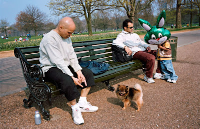
"This photo is one of my favorites, for various reasons. I like the fact that there are two or three things happening in the shot at the same time. The man pointing at his dog, the dog sticking its tongue out at me and the balloon blowing over the child’s face. I remember when I was shooting this scene that this particular frame everything felt like it had fallen into place at the same time and luckily for me it had.
As well as having captured two or three things happening in one shot the most exciting thing about this image for me personally was that I walked into the scene and out of the scene without anybody (apart from the dog!) noticing me. They were all so engrossed in their respective world.
I shot the picture with a 28mm lens on my Leica so I was fairly close to the man in the foreground. I shot around 15 frames of the scene then left and nobody noticed me at all. I felt invisible. This is one of the greatest feelings you can have as a photographer - invisibility."
"This picture was taken in one of my favorite spots - Oxford Circus. For anyone who hasn’t been to London it is the busiest shopping street in town and this is the bottle neck in the middle were sometimes it can get so busy that you can’t move.
The photo is of 3 tourists (I believe) the man in the foreground, lost and nervous, map in hand and covering his mouth. Followed by two separate tourists young and confident and more than happy to display the route that they have taken. Although they are both separate they have been connected by me the photographer. This was a one frame opportunity. I saw it, shot it, and no time to shoot anything else."
"This is one of the first photographs I ever took. It was 1999 and I was 23 and had read in the paper that the Millennium Wheel was going to be erected that weekend.
I spent the whole weekend at the site on the River Thames waiting with tourists and enthusiasts to see the wheel go up. I shot hundreds of pictures of which none were any good and I was beginning to think this photography business was rather expensive. Then this old man turned up for about 30 seconds, looked up at the wheel and then nonchalantly rode off.
When I saw the picture I freaked! I was all fingers and thumbs. Your brain is like a warship going “action stations! alert alert!” I can still remember the adrenalin and how I had to calm myself down to control my shaking. I flapped behind him shooting as many frames as I possibly could, knowing that it was potentially a very good shot. Only one of the frames worked, all the others were too busy, too light, too dark or too shaky. This was the first time I really felt like a photographer and I knew from that point on that is what I wanted to be."
"This is one of my favorite photos and one that I get most compliments on. I shot it in Trafalgar Square. Unusually I didn’t take this photo on a Leica. I was using a Canon film SLR. The Leica was in repair. I knelt down on the step and focused my camera on the white wall in the background. I was hoping to get lots of black legs walking along in various graphic shapes. I had been bent over with my bum in the air for about half an hour when a rather confident pigeon walked past. I instinctively shot this frame but as I was doing it I noticed something had happened with the human legs as well. It all happened so quickly that I wasn’t exactly sure what I had got but something felt right. When I received my contact sheets back I was delighted to have found the legs within the legs and the way that the coats mimicked the pigeon's tail. I like to think that humans aren’t the only ones that need to get up early to go to work."
"Another shot taken in Trafalgar Square. This, unlike the pigeon photo, was a one frame catch. I walked into the square and saw some school kids watching a man in headphones dancing, he was body popping badly. One of the school kids joined in, body popping really well, getting cheers from his class mates. I got closer to the scene and as the young body popper stopped I heard one of his friends ask him “to do his summersault”. He replied that he would need to practice it first and they both left the commotion and walked over to the grass where he tried doing a somersault. This was his non public attempt. I think this is a good example of being acutely aware of everything that is going on around you and listening. Had I been wearing my ipod (something that I occasionally do to get inspired and feel invisible) I wouldn’t have heard the two boys' conversation and would probably have missed the moment. The thing I like about this frame is it initially appears such an ordinary situation."
Matt Stuart shoots street photography and commercial work in London. He is a member of In-Public, an online street photography site. More of his photography can be seen on that site, and on his personal site. Stay tuned to this blog in the near future for more Q & A with Matt Stuart.
Tuesday, January 8, 2008
Monday, January 7, 2008
Cue matching ballparks
As if on cue, Michael David Murphy has just posted a Joel Meyerowitz pairing here.
Sunday, January 6, 2008
Hockney On Photography
It must be 80s week because after devouring A Summer's Day my next photo book was Hockney On Photography. This is basically an illustrated transcription of 5 years worth of conversations between David Hockney and photographer Paul Joyce that occurred in the mid-80s during the period Hockney --who made his name as a painter-- was experimenting with photo collages.
I have to say this book has turned out to be much different than I'd expected when I first picked it up at Powell's. I've always liked Hockney's photo collages, especially the Polaroid grids. They show a very unique vision. The texture of the polaroids makes them feel somewhat like sculptures, and something about the Polaroid color in a grid with Southern California light is really magical. So I dove into the book with anticipation thinking it might shed light on his process.
Don and Christopher, Los Angeles, 6th March 1982
While the book offers insight into Hockney's process, what it does mostly is trash photography. Photography will never equal painting. Photography is only good for mechanical reproduction. Photography can't show time. Photography never did this and will never do that, etc. If you are looking for a pat-on-the-back book about how great it is to be a photographer, this ain't it.
In hindsight I should've expected something similar. After all, Hockney is a painter first and foremost. Photography was just a passing phase for him. As for Paul Joyce, I don't know his work but as a photographer you'd think he would stick up for the art. Instead, he plays the fawning foil. Sample dialog:
Another passage:
Noya and Bill Brandt with self-portrait, Pembroke Studios, London, 8th May 1982
Whether he was successful probably depends on who you ask. For me, some of them work better than others. In the best ones there is indeed a refreshing variation on the normal single perspective photo. He shows the same subject matter from various angles, juxtaposed next to itself like a jumpcut in film or like, well, a cubist painting. With the polaroids, these jumpcuts are tied neatly into a unified grid, so that looking at the image is almost like seeing through a mesh screen. For me the nonpolaroid snapshot collages, are generally less successful. They seem more haphazard and amateur. For example, consider these two shots of Hockney's mother, the first a polaroid composite and the second from snapshots:
My Mother, Bradford, Yorkshire, 4th May, 1982
Mother I, Yorkshire Moors, August 1985 #1
It probably says something about my personality that I prefer the Polaroid grid. I like things to line up. Anyway, the book isn't so much about his images as about Hockney's sour view of photography. Some of his attitude can be laid to plain old painting-centric elitism:
Ouch! Finally:
Overall, looking at this book is a bit like looking at an old photo. The 80s were already 20+ years ago --Has it really been that long?-- and there is a certain dated quality to the ideas and images, and to the cultural references. The glasses, the hairstyles, the colorful poolside lifestyle, it all whispers "80s" in your ear. The book would go well with Men at Work or Tears For Fears as background music.
The Desk, July 1st, 1984
That said, sometimes photographs prove to be more interesting as they age, and the same can be said for this book. Hockney makes a few astute predictions about the impending digital era. This was in the mid-80s before Photoshopping had really taken off. But Hockney says that the arts and publishing will be revolutionized, and he turned out to be right. He delivers a prescient warning about computerized collage and its threat to photography's claim to reality. Alas his main prediction --that his grid style would revolutionize photography in general and that once people caught on everyone would do it-- didn't come to pass.
I have to say this book has turned out to be much different than I'd expected when I first picked it up at Powell's. I've always liked Hockney's photo collages, especially the Polaroid grids. They show a very unique vision. The texture of the polaroids makes them feel somewhat like sculptures, and something about the Polaroid color in a grid with Southern California light is really magical. So I dove into the book with anticipation thinking it might shed light on his process.
While the book offers insight into Hockney's process, what it does mostly is trash photography. Photography will never equal painting. Photography is only good for mechanical reproduction. Photography can't show time. Photography never did this and will never do that, etc. If you are looking for a pat-on-the-back book about how great it is to be a photographer, this ain't it.
In hindsight I should've expected something similar. After all, Hockney is a painter first and foremost. Photography was just a passing phase for him. As for Paul Joyce, I don't know his work but as a photographer you'd think he would stick up for the art. Instead, he plays the fawning foil. Sample dialog:
PJ: It's difficult to be an artist as good as you are and be able to cope with it, isn't it?
DH: Yes. If I found it difficult, then everybody else certainly will...There's not that many people who are willing to spend that kind of concentration and time on one particular piece.
PJ: Certainly not photographers, because they haven't got that built into their consciousness...
DH: They are not used to it, no.
Another passage:
The main obstacle Hockney thinks he has overcome is the limited perspective of a stationary camera. A single photograph can only show one point of view, usually for a small period of time. "All photographs share the same flaw," he says. "Lack of time." He then goes on to trace photography's misguided view back hundreds of years to the Renaissance and invention of the Camera Obscura. Cubism helped to topple the single perspective in the hand-arts, but with photography it still exists. The idea behind Hockney's grids was to inject multiple reference points into photography, in short to make it cubist.
PJ: I honestly think that photography is no longer the same after this work of yours. I'm absolutely convinced of that.
DH: I know that. It cannot be the same, because so many things have been overcome here.
Whether he was successful probably depends on who you ask. For me, some of them work better than others. In the best ones there is indeed a refreshing variation on the normal single perspective photo. He shows the same subject matter from various angles, juxtaposed next to itself like a jumpcut in film or like, well, a cubist painting. With the polaroids, these jumpcuts are tied neatly into a unified grid, so that looking at the image is almost like seeing through a mesh screen. For me the nonpolaroid snapshot collages, are generally less successful. They seem more haphazard and amateur. For example, consider these two shots of Hockney's mother, the first a polaroid composite and the second from snapshots:
It probably says something about my personality that I prefer the Polaroid grid. I like things to line up. Anyway, the book isn't so much about his images as about Hockney's sour view of photography. Some of his attitude can be laid to plain old painting-centric elitism:
Later he eases into the it's-all-a-crapshoot dismissal that I think most nonphotographers carry somewhere in the back of their head. I can imagine my inlaws saying, or at least thinking, something like this:
PJ: There's something about photography which is deeply dissatisfying. And I've been struggling to pinpoint just what that is.
DH: I think you must feel that before you get deeply interesting in what's going on here. There are people, after all, who don't feel that, who think photography is perfectly all right. But for the people who think, the ideas will click. ...A certain cultivation is needed to be able to read painting to derive real enjoyment from it. But photography is different --the number of amateur photographers around runs into millions, doesn't it?...
The difference between what you might call a very great photographer and a very good photographer is not as much as the difference between a very great painter and a very good painter. I can think of the difference between Rembrandt and one of his contemporaries who you would call very good. The difference is still very great, whereas the difference between -- well, how many great photographers are there? Just name one and the difference between him and any other good photographer is much slighter.
I've seen professional photographers shoot hundreds of pictures but they are all basically the same. They are hoping that in one fraction of a second something will make that face look as if there were a longer moment...If you take a hundred, surely one will be good. It could be anybody doing it...
There are few good photographs, and those good ones that do exist are almost accidental.
Ouch! Finally:
Photography has failed...How many truly memorable pictures are there? Considering the milllions of photographs taken, there are few memorable images in this medium, which should tell us something.
Photography can't lead us to a new way of seeing. It may have other possibilities but only painting can extend the way of seeing.
Overall, looking at this book is a bit like looking at an old photo. The 80s were already 20+ years ago --Has it really been that long?-- and there is a certain dated quality to the ideas and images, and to the cultural references. The glasses, the hairstyles, the colorful poolside lifestyle, it all whispers "80s" in your ear. The book would go well with Men at Work or Tears For Fears as background music.
That said, sometimes photographs prove to be more interesting as they age, and the same can be said for this book. Hockney makes a few astute predictions about the impending digital era. This was in the mid-80s before Photoshopping had really taken off. But Hockney says that the arts and publishing will be revolutionized, and he turned out to be right. He delivers a prescient warning about computerized collage and its threat to photography's claim to reality. Alas his main prediction --that his grid style would revolutionize photography in general and that once people caught on everyone would do it-- didn't come to pass.
Friday, January 4, 2008
Six Degrees of Joel Meyerowitz
Yesterday I had another Joel Meyerowitz Deja Vu. While looking through A Summer's Day, I turned up this image:
It looked familiar the moment I saw it because last July I'd made a very similar image:
Cross my heart I didn't know about the Meyerowitz image at the time. Perhaps this has the makings of a game similar to Six Degrees of Kevin Bacon. Given any photograph, the object of the game is to find the Meyerowitz image that matches it.
In fact Lawrence Weschler has already taken this a step further. In a wide ranging interview about Meyerowitz's Ground Zero project, he draws uncanny comparisons between Meyerowitz's photographs and paintings by Vermeer, Bierstadt, Paranesi, Rembrandt, Hals, and many others.
Go ahead. Give it a shot. Any matches you find, please send them my way and I'll post them here.
Thursday, January 3, 2008
Self Submission
A few weeks ago I took over the reigns as submissions editor at In-Public. People send me their photos and if I think they would be of interest to the group I pass them on to everyone else. I'm sort of an online doorman.
So far it's been interesting. There are numerous submissions coming in daily from all over the world, and through them my insatiable need to see new photographs is somewhat met.
The flip side is that most of the submissions tend to be of mediocre quality. Many are from people relatively new to photography. Since In-Public specializes in street photography, the same street cliches tend to appear in submission after submission. The tendency is to aim for one line jokes, quick hitting gimmicky photos without much depth. The billboard mocking the person next to it. The bum next to the high-heeled fashion model. The gesture which blends in or mimics the environment. The window display reflection showing whatever. Manikins. Etcetera.
The funny thing is I have taken many of these same photos myself. Not only that, I continue to look for these photos, as I suspect all street photographers do. So seeing them over and over again in countless submissions has made me recast an eye on my own work. Is it so different? I hope that it is, but now I have been forced to examine exactly how. What separates good street photos from average ones? Is there much difference, for example, between this photo by Magnum great Richard Kalvar
and this one from a recent In-Public submission?
A slight change in composition perhaps, but both photos basically recycle a cliche we've seen time after time.
So what is the difference? One conclusion I've come to is that fine street photography is poetic in a way that one-hit wonders aren't. What may look at first to be a one line joke is instead a Zen Koan. Just as there is a qualitative difference between The Far Side and Family Circus, there are subtle yet wide difference in superficially similar street photographs. Consider another Kalvar photo
At first glance it seems to be a one-liner. The popsicle matches the harmonica. Ba-da-bing! Yet looking closerthere is a poetic absurdity to the whole image that makes it work. What is the foot doing there? The beer sign is fantastic, so misplaced that he couldn't have thought it up. How did he see all these elements at once, and how did he coordinate them so carefully into a visual jigsaw? I think what's most wonderful about the image is that it's absolutely meaningless. There's no story here. It's just a moment. It's not meant to back up any article or be included in any grand project (about popsicles perhaps?). It just is. Or was.
Here's one of my favorites by Jeff Ladd
What is going on here? Nothing. Everything. Life. This photo hits the mark without aiming, because there's nothing in the photo to aim at. Bullseye.
I've been told by several people that my own street photos resemble one liners. There may be some truth to that. But I like to think of them more as koans. For example, is this photo a one liner or an absurdity?
In one sense it's a visual gag. The mouth looks like a pupil, end of story. Yet for me this photo brings up issues of coincidence and timing that I can't explain. What are the odds of that kid holding his mouth just right for a split second? It's downright mysterious. When you see it this way you've hit the bullseye.